Rebranding is hard, Part 3.
By: Grant Sanders, Creative Director
Preface: This is the third in a series of posts that chronicle our agency's work to rebrand and refine our look and feel. Check out Rebranding is hard, Part 1 and Rebranding is hard, Part 2. They're worth a look.
"We don't do easy."
We are the agency that doesn't do easy. That subhead above in quotes is our slogan. It's something we developed two years ago when we launched the first phase of our rebranding efforts. This philosophy is what makes us different. So when we took a fresh look at our logo and website, we wanted to create a new look that works with that thinking — i.e., it works just as hard as we do.
As you probably guessed, it wasn't easy. In fact, it caused us to ask a lot of tough questions.
For example, you know the age-old question, "Which came first, the chicken or the egg?"* We asked the same kind of question of this project: "Which comes first, our site, or our logo?"
I'm going to go out on a limb here and state with some authority that in today's business world, for all intents and purposes, your website is your brand. Or at least it's the closest thing to embodying a complete and total experience of one's brand. This is one of the reasons we took on both a new logo and a new site simultaneously. Another reason was: it was time. A third reason: see slogan.
A logo that adapts.
As if creating a logo that cleanly and clearly conveys our name to the world at large wasn't difficult enough (cue slogan). We wanted one that also conveyed our "We don't do easy" ethos in a creative way. A flex logo felt like a good solution. Flex logos are marks that have a well-defined form, but one part of it is variable and adaptable to different situations.
The idea behind this flexibility is to make our clients literally part of our identity (because we are so close to them that we often feel like one organization) by flexing the logo to include their imagery, their industry, even their corporate colors. What kind of advertising agency would go to such extremes to bring clients into their logo? Maybe one with the above slogan? Yup.
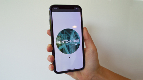
ACD, Trevor Dobrowsky and I created images, animations, and video clips that could fit within a circle, with our new, clean logotype in the center, so that our logo could be different nearly any time anyone was exposed to it. Whenever possible, our goal is to create a logo that is animated in some way.
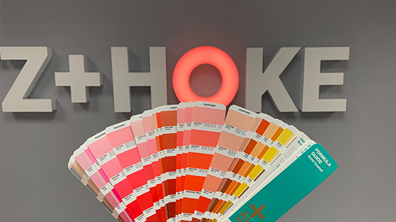
Not every application of the logo can be a big animated circle, so we created a few other versions that shrink the circle down to take the place of the O in Hoke. In those cases, we still have the option of changing the color of the O to match the color of the application of the mark.
A site that evolves.
The one thing that we wanted to avoid with our new site was a massive development cycle. We also wanted to dispel the myth that the cobbler's children have to go shoeless. ("We are cool and we deserve a cool site!" was our battle cry.) So we decided on an iterative development scheme that allowed us to create a minimal launchpad site with just enough content to serve as a viable communications vehicle, yet with areas that we could improve every quarter. This is not as easy as a one-and-done effort. Fine. Recall slogan.
Our new site launched with essentially one main page with a few subpages attached to it. The idea is to constantly evolve the experience so that it faithfully serves to inspire our audience, and frankly, ourselves. So in Q3, 4, 1, 2 and beyond, the site will change as we measure engagement and find out what our visitors need and want.
At the top of our new site is our logo in all of its video-animated glory. Our hardworking, creative, magical dev unicorn colleagues did an incredible job with the build and even put in the extra effort to ensure we were just as freaking awesome on the phone as we are on the desk. Easy? Nope. Slogan.
But wait, there's more.
Did we mention our signage? It's pretty cool. We created interior and exterior signage for our building which included enlargements of our business cards, a massive manifesto six feet high and our logotype in 3-D with an LED-backed O that changes color. Why? So we could add the color of whichever client or partner/vendor company was visiting us that day to our logo. On the fly.
Was that hard to do? Kinda. 'Nuff said.
__
Grant Sanders is the Creative Director at Mintz + Hoke and he splits his time between Avon, CT and Nantucket, MA where he sometimes tries to take it easy.
*It's the egg, actually. Ask any velociraptor.