Exploring The Blending of Color and Brand Identity with Pantone’s 2019 Color of the Year
Every year the Pantone Color Institute declares an annual color, basing its choice on trends observed in the entertainment industry, art, fashion, design and more. Pantone declared Living Coral as the color of the year, describing it as “an animated, life-affirming shade of orange, with golden undertones.” And already we can see celebrities, fashion models and decorators adopting the color.
We spoke with our Associate Creative Director, Trevor Dobrowsky, and our Creative Director, Grant Sanders, about the role color plays in the development of brand identity and how we manage color’s inherent subjective nature in our work.
How does the announcement of the color of the year affect the work that we do at Mintz + Hoke?
Trevor: “I think it’s important to know what the trends are, but you don't want to be trendy. Good creative work should do something unexpected, to zig when everybody else zags so that we can get everybody's attention. I think that it's nice to see a color like that be out and a little bit more visible to the general public, because it's kind of a cool color we've used in the past without even knowing how cool it was.”
We did use living coral in the past! Trevor, you designed the Whittlesey logo which incorporates living coral. What was the creative rationale behind this decision?
“From my perspective, Whittlesey was being seen only as an accounting firm—a bunch of advisors and very smart people. By shifting that perception of their brand identity, they wanted to demonstrate greater value to clients with services like business consulting and cybersecurity, while recruiting younger talent with new skill sets. We wanted to do something a little unexpected to help them achieve a modern appearance, so we used Living Coral to bring freshness to an established brand.”
Grant: “Right. When we take on an engagement like this, we will do a competitive audit. We took the websites and materials of competitors in the market that had an established brand, put them up on a wall and started to see what colors were showing up in everybody's materials."
Trevor: “It became really clear that the warm, pink-ish, red-ish coral color was not showing up in anybody's work. It was something that we could grab hold of.”
What does the color of a company’s brand say about what they stand for?
Trevor: “I mean, it says quite a bit. Color creates such a mood, so having a certain color in your logo; it certainly could represent a lot of different things. I know in the financial market they do a lot of blues and greens, which represent trust and commitment. And green is also the color of money.”
Grant: “A really good example is Spectrum. They were a new brand that we were helping to launch. They were coming out with a new line of medical plastics. They had been using the name Spectrum but needed their customers to connect them with health care. So because they were in medical plastics, and because blue is an important anchor color in the industry, they really felt that blue was the way to go.”
Grant: “So we generated dozens of blue logos, and ended up with something that was nice and fresh and clean. The Spectrum logo told everyone that saw it that they were in health care, which is what we wanted in the first place.”
Color can be interpreted in different ways. How do we manage that subjectivity in our line of work in order to deliver a persuasive message intended to be perceived in a specific way?
Trevor: “I guess it depends on the industry, right? And doing your research. Doing a dig and finding out what competitors are doing, what people are doing in the space, and going from there. Some of our clients play a little bit safer and stay in the same sandbox, but others want to do something a little bit more radical and push the bounds and really stand out. So it really depends upon what the ultimate goal is. Do we want to stand out? Do we want to look different? Or do we want to fit in? Just depends upon the goal of the project itself.”
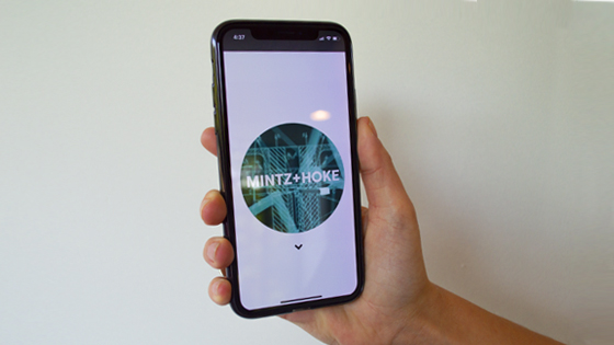
In the Mintz + Hoke logo, we change the color of the ‘O’ in ‘Hoke’ to match our clients when we meet them. What does that say about us?
Trevor: “Well, it says we don't do easy. Coming up with a color palette that is constantly changing and evolving is not an easy brand standard to create in the first place. It says that it's really hard to separate Mintz + Hoke from its clients, and its clients from Mintz + Hoke.”
Grant: “When you look in that O and see that circle that's filled with the client's color or an image that represents the client’s industry, you instantly say that we're so deep in our clients' businesses that we made them part of our identity.”